Wednesday, December 21, 2016

Processing UAS Data

Pix4D Review

Overview:

This lab will use Pix4D software to construct a orthomosaic image. Previously, this class had only made georeferenced mosaic imagery. The software Pix4D is the current premier software for constructing point clouds, and is also very easy to use.

Before starting Pix4d, it is important to make sure the images are highly overlapped to create a 3D model that is accurate. The more overlap between images, the more accurate the 3D model will be. More overlap leads to better automatic aerial triangulation which creates a sharper 3D model. If the user if flying over sand or snow the overlap must be at least 85% frontal overlap and at least 70% side overlap. A large percentage of overlap is needed because sand and snow have very little visual content, so each overlapping image can get as much contrast between images as possible. Rapid check is to verify the proper areas and coverage of the data collection. Rapid check processes the data very quickly, but the results have fairly low accuracy.

Pix4d can process multiple flights at once as long as the coordinate system (both horizontal and vertical) of the images is the same. Oblique images can be processed in Pix4d as long as they have good overlap and GCPs. GCPs are not necessary to use Pix4d, but they are highly recommended because they create a much more accurate model. The quality report is used to find the strength and quality of the matches. 

Pix4D Software:  

Dr. Hupy provided the class with UAV imagery from a sand mine south of Eau Claire in order to complete this lab. To start, all images are imported into Pix4d mapper. The area of interest (AOI) is chosen and the flight path can then be visualized. For this lab, a freely drawn polygon was used to create the AOI. After processing the images, the quality report is then created and provides specific details about the images. Figure 1 is the quality report for this lab.

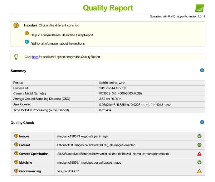
Figure 1: Summary of the quality report

Image 2 is a orthomosaic and the corresponding sparse Digital Surface Model (DSM) before densification created in the report.
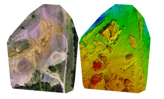
Figure 2: Orthomosaic and DSM based off the report
Figure 3 is an image produced by the quality report showing areas of overlap with the images. Areas in green are the areas that have multiple overlapping images. Areas that are red and yellow are areas where overlap is poor. Areas in the middle of the image have more overlap than the edges of the image. As long as the area of interest is an area of high overlap, the output will be of high quality. 
Figure 3: The areas of overlap in the AOI


Final Overview:

This lab introduced how to quickly and easily use pix4D to process UAV data. Pix4D is a great way to visualize 3D data and produce a high quality map. Pix4D can be used by anyone with UAV data to create a map. Overall, this was a great lab to complete to finish class.


Monday, December 5, 2016

Topographic Survey


Introduction:

This lab is intended to teach how to engage in a survey of various point features on campus using a high precision GPS unit. The data will be collected as a  collectively . Each person will take turn with a partner to take a GPS point with the GPS unit. The data gathered should then be turned into continuous interpolated maps. The following interpolation methods should be used: IDW, Kriging, Natural Neighbor, Spline, and TIN.

Study Area:

The study area for this lab is a green patch of grass near the 'Sprites' between the buildings Centennial and Schofield. Figure 1 below is a map of the study area. The data points are seen below between the two academic building. This is a common area where students gather and 'chill' before or after classes.
Figure 1: A map of the study area where the data points were collected

Methods:

The data points were gathered with a survey grade GPS that has sub centimeter accuracy. The GPS records the points though a bluetooth connection. The points were gathered using a random sampling method. The random sampling method is a great method to use because it is an unbiased way to acquire a random sampling of data points. Figure 2 below are the data points that were gathered in the lab.
Figure 2: The data points gathered with the survey grade GPS
The next part of the lab is to use different interpolation methods on the acquired data points.
The following methods are: the following: IDW, Kriging, Natural Neighbor, Spline, and TIN.The inverse distance weighted (IDW) interpolation method is used to predict the elevation of the continuous surface surrounding the data points. The Kriging method generates an estimated elevation of the surfaces surrounding the data points by using the elevation of the data gathered as a reference. The Natural Neighbor method is similar to the methods above except the elevation data used as a reference is taken from data points that are near the area in question. The spline method uses a polynomial algorithm to create the continuous surface model with the elevation points gathered with the class. The last interpolation method used was TIN. A triangulated irregular network (TIN) is a representation of elevations created with triangles calculated with the gathered three-dimensional coordinates.

Results/Discussion:

The first interpolation is seen in figure 3 below. The inverse distance weighted interpolation (IDW) method shows the elevation for a small grass area with a knoll on it. The areas in the left upper portion of the map are areas of high elevation because the points were taken on the knoll above the rest of the grassy area.
Figure 3: The IDW interpolation was used on the data points in the map above
 Figure 4 seen below is a map of the data points using the kriging method. The kriging method shows the elevation for a small grass area with a knoll on it. The higher elevation areas are white or pink in color. The elevation is high in those areas because of the grassy knoll.
Figure 4: The kriging interpolation method was used on the data points in the map above
Figure 5 below is a natural neighbor interpolation map that shows the elevation for a small grass area with a knoll on it. The areas in the left upper portion of the knoll are areas of high elevation because the points were taken on the knoll above the rest of the grassy area.
Figure 5: The natural neighbor interpolation method was used on the data points in the map above
Figure 6 seen below is a map of the data points using the spline method. The spline method shows the elevation for a small grass area with a knoll on it. The higher elevation areas are white or pink in color. The elevation is high in those areas because of the grassy knoll.
Figure 6: The spline interpolation method was used on the data points in the map above
Figure 7 seen below is a map of the data points using the TIN interpolation method. The TIN method shows the elevation using a number of triangles put together creating the small grass area with a knoll on it. The higher elevation areas are the areas with red and orange coloring. The elevation is high in those areas because of the grassy knoll.
Figure 7: The spline interpolation method was used on the data points in the map above
A few weeks ago, the lab was to create interpolation maps of stratified sampling. This week, we used random sampling. The stratified sampling created a much more realistic representation of the area being surveyed versus the random sampling we just did in this lab. The random sampling interpolations created maps that were not very specific to the terrain we gathered GPS data points on.

Conclusion:

Upon the conclusion of this lab, it was clear that the stratified sampling method is a better data gathering method than then random sampling method. The stratified sampling method was used in a previous lab for this class. If this lab were to be conducted again in the future, a word of advice would be to spread out the data points in the area of interest. Another word of advice would be to make the interpolated maps somewhat translucent to see the area in which the data point was taken. Overall, this lab was interesting and informative which made the interpolation process enjoyable.

Tuesday, November 29, 2016

Arc Collector

Introduction:

This lab is designed to continue developing the skills gained in the last lab with ArcCollector. The use of cellphones is nearly universal, so ESRI decided to cash in on the cellphone fad by making an app that allows for data gathering with the touch of a thumb. In the previous lab, we used a database that was set up prior to use. In this lab, each student created his or her own database with their own question in mind. Since each person has their own database, it is critical the domains are set up correctly. This specific lab is analyzing the temperature at ground level, temperature at 2 ft in the air, type of ground, and whether or not it needs an upgrade from the UWEC grounds-crew. The completion of this lab depends on a successful database set-up, smooth data gathering with the kestrel thermometer, and ArcMap on the desktop computer to create the final product.


Study Area:

The study area for this lab is nearly the same as it was in the previous lab. The UW-Eau Claire campus on the South side of the Chippewa River is the study area for this lab. Figure 1 below is a map of the area of interest. UWEC's main campus is the study area for this lab. The data was collected on 11/29/16 at around 11AM, so the temperature had not peaked for the day. The high for the day was 46 degrees Fahrenheit.
Figure 1: The study area of this lab is the UWEC campus

Methods:

In order to set up the online database, there were a few requirements for this lab. One was the database required three fields for attributes, one text field for notes, a floating point or integer, and one of the persons choice. The different domains help normalize the data in the field to make data collection enjoyable instead of frustrating. Figure 2 below is the domains used for this lab.
Figure 2: The domain for the database
The domains for this lab are: ground condition, ground cover, notes, temperature at 2 feet above the ground, and the temperature at ground level. The temperature domains required a long integer field type. The notes field is text and the ground condition and cover are both coded values. This means the one of the coded valued must be selected.

Once all of the domains were set in place, a test point was used in the corner to make sure there were no errors in the set up--which there was not, so the data gathering was the next thing to do. 20 data points were gathered around the UWEC campus. Once the data was collected, it was brought into ArcMap to create the continuous model of the temperatures at two different heights.

Results/Discussion:

Figure 3 below is the final map of the temperature in Fahrenheit at ground level. Most of the data points were between 39 and 41 degrees Fahrenheit.
Figure 3: A map of the temperature at ground level

Figure 4 below is the final map of the temperature in Fahrenheit at 2 feet above the ground. Most of the data points were between 37 and 38. This is nearly two degrees less than the ground level temperatures.
Figure 4: A map of the temperature at 2 feet above ground level

The results of this particular lab were slightly different than initially thought. The temperature was overall colder 2 feet in the air whereas the ground level temperatures were all warmer. This could be because the ground is still in the process of freezing for winter, or because the larger the distance away from the ground, the colder the air will be. Unfortunately, the colder temperatures caused for a shortened data gathering time, so only 20 data points were collected in total. Overall, this lab proved to be a tough challenge, yet rewarding at the same time. The link below is a interactive map on ArcCollector with the data points collected. (http://arcg.is/2g4mCMD)


Monday, November 14, 2016

Micro-climates at UWEC

Introduction:

Cell phones often times have a higher computing speed and power than most GPS units, so it is a reliable option to use online data to aid in data collection. Arc collector is an app that allows data collection online from a cell phone or tablet. This opens doors for gathering data in places that was once difficult. As an entire class, we split up with a partner and went to the assigned zone. Once within the zone, you and your partner could start taking GPS points anywhere you wanted. We gathered 175 data points total as a class. As we were gathering data, we could see other groups data points pop up on our own maps. This is the exact reason why Arc Collector is such a useful tool. Many people can access and gather data in real time while being together or many miles apart.


Study Area:

The University of Wisconsin Eau Claire's campus was broken down into 7 different zones. Two pairs of two went to each zone. The zone that we were assigned to was zone 1. Figure 1 below is the map of campus broken up into zones.
Figure 1: Campus split up into 7 zones 

Zone 1 is the blue highlighted area on the map above. The area also included the walking bridge, Haas academic building, and two large parking lots near the Haas and HSS academic buildings.


Methods:

Before we could gather data points, we needed to download Arc Collector from the app store in order to connect our devices to ArcGIS online. ArcGIS online makes it possible to run the software through devices such as a cell phone, or anything with a high processing system. After we connected to ArcGIS online, we went over the attribute data that was going to be collected in the field. The measurements we were taking at each point were the temperature, wind speed, wind direction, and dew point.

Once we reached zone 1, we decided to take our first point in the middle of the walking bridge on campus. We took out our handy Kestrel thermometer to gather the necessary data. We took the temperature and dew point as well as the wind speed and direction. Figure 2 below is a picture taken while recording the third data point.
Figure 2: A photo taken at a data point
We recorded 11 data points in zone 1. After all groups had finished collecting their data, we could all look at our individual maps, but they all had the same exact data. This is a great way to keep data normalized. Figure 3 below is a map of all the data points collected by the class.
Figure 3: Data points collected by the entire class
Figure 4 below is the attribute table for all of the data points located in figure 3 above. The four columns that were of main interest were: TP, DP, WS, and WD.
Figure 4: Attribute table for the classes data
Since all of the data points are together, we could make several maps of the four micro-climates on campus. For all of the following maps, I created a continuous surface feature to show the interpolated average of each of the attributes. I used the inverse distance weighted (IDW) interpolation method on all of the maps. The IDW interpolation method estimates cell values by averaging the values of sample data points in the near area of each processing cell. Figure 5 below is the map created with temperature data.
Figure 5: A map of temperature across the UWEC campus

The temperature was gathered in Fahrenheit for this lab, so all map with temperature will be in Fahrenheit. Figure 6 below is a map of the dew point across UWEC.
Figure 6: A map of dew point across the UWEC campus

The dew point is a measure of the temperature air has to be to condense and form dew. Figure 7 below is a map of the wind speed on campus.
Figure 7: A map of wind speed across the UWEC campus

The wind speed was measured in miles per hour for this lab. Figure 8 below is a map of the wind direction while taking the data points.
Figure 8: A map of wind direction across the UWEC campus

The direction the wind was coming from was recorded along with the rest of the attribute data for each data point. I chose to keep the wind speed in the map to show which ways the wind was blowing very strong versus not very strong. I made all of the continuous surface features 15% transparency on each map to give an idea of where each data point is located.


Results:

Each map above is different from each other, yet they have everything in common. The wind speed map is particularly interesting in that the wind speed was highest on the middle of the walking bridge. There is always a lot of wind when walking over the bridge, so the map was not surprising, yet it still interesting. I originally did not have my maps with a 15% transparency, and I am very glad I went back to change that. The transparency of the continuous layer makes it easier to see where the data points were taken. The temperature is nearly even across the map, and that could be because the sun was shining and it was a very nice day out. The one interesting area on the temperature map was an area that is heavily wooded. That area was much colder than the rest of campus most likely due to the fact that the sun was not shining on that area. The dew point was higher in areas of more populated areas such as the Davies parking lot and the back of Davies area. The dew point was much lower in areas where things were more spread out and there were less people. The wind direction was all over the place, so this could be because of human error, or the wind was blowing in many directions while we were gathering data. The possibilities for both options are very likely, so there is no definite answer to why the wind was blowing in so many directions.

Conclusion:

This lab exercise allowed me to gain knowledge about a new way to collectively gather data. Arc Collector had opened many doors of opportunities in the field. Arc Collector was very effective in that the entire class was able to create a set of points with normalized data without any problems. It would be interesting to look at micro-climates across UWEC in more detail and with more fineness. There may have been some patterns in the data that I missed, but for the most part, this lab was definitely a success. Arc Collector did its job of putting together all of the data gathered, and we were able to successfully analyze four different types of micro-climates at UWEC.


Tuesday, November 8, 2016

Navigating the Priory with a Map and Compass


Introduction: 

The purpose of this lab was to use the maps we created last week in class to navigate the terrain to find points behind the Priory. The Priory is a UW-EC owned building about 5 miles away form campus. I was part of group two with two other people. For this lab, we could only use one persons maps we created last week. For this lab, we ended up using the maps I created as well as a compass to find five points behind the Priory. We brought a GPS along with us to track our path. We were given five points to find in UTM meter form. 

Methods: 

After meeting at the Priory on November 2nd 2016, we had to approximate where the five points we needed to find were on the map. The ticks on the map were in 50 meter increments that helped approximate where the point would be out in the field. Figure 1 below is a picture of the five coordinates we needed to find. 
Figure 1: Five coordinates group 2 needed to find
Once we knew where we were headed, we needed to figure out our pace count for 100 meters. My pace count was 76 paces per 100 feet. The pace count is used when moving towards a distant object when direction is not clear. In this case, we had to walk in the woods and find our points, so using a pace count to track our distances was helpful. We also used a Trimble Juno 3B GPS as seen in figure 2 below to track our path to our points. 
Figure 2: The GPS group 2 used to find the 5 points on the paper
In order to find the coordinates we were looking for, we used the compass to find the angle degree we were going to walk in. We pointed the north arrow of the compass north and lined up the compass in a straightedge to the point. This gave us a working "compass" to the point. We needed to do this from each point to the next. We decided to go to point 1 first, point 5 second, point 4 third, point 2 fourth, and point 2 fifth. In order to use the compass, we had to adjust the reading for each point. Then, we had to hold the compass at chest level to read the direction we had to walk. The person holding the compass stayed in one place and another person counted their paces to a tree in the compasses path and stayed there. We repeated this process over and over again until we found all our points. 

Results:

Group 2 took a rough path to our first point. Figure 3 below is a map of the track the GPS captured. 
Figure 3: A map of the GPS tracked as we were finding the five data points
It took a while to get used to finding the coordinate points. We took a heavily wooded path to the first data point labeled '1' on the map above. We then went to point '5' but we took a walking path to avoid going back into the dense brush. Then we went to point 4 which was close to point 5 and it was relatively easy to find. Then we went to point 3 and finished with point 2. 

Figure 4 below is a map of the GPS path of all of six groups in the class. The pink dots on the map represent all possible coordinate points given to the entire class. It is clear that all of the paths captured by the GPS were not straight lines and it appears that we all ran into some type of problem that took the group off course. Sometimes we were slightly thrown off because a large tree or massive brush pile was in our way. We had to move around nature and figure out how to overcome problems regarding paths.
Figure 4: A map of the GPS tracked paths for all six groups in the class

Conclusion: 

This lab featured using a map with a grid system to find five points in the Priory that were given to us as coordinate points. All we could use was our maps, a GPS for tracking, and a compass. The overall execution of this lab was definitely attainable and really taught me how to reach a destination with coordinates only.  
Using a 50 meter UTM grid was an okay measurement for this lab. The spacing was a little far apart, but it worked out in our favor nonetheless. This lab made it clear that straight lines from one point to another are nearly impossible because of the surrounding landscape. From an aerial view, the Priory does not seem like tough terrain to hike, but elevation changes as well as dense forests caused a bit of a struggle for group 2. 


Tuesday, November 1, 2016

Development of a Field Navigation Map


Introduction:

In order to navigate around the Priory (the study area), we need to know some type of location system, coordinate system, and some type of projection. The issue is that coordinate systems can confuse people depending on what scale they are working with. For example, State Plane and UTM are two popular coordinate systems, yet they are very different. UTM is measured in meters whereas State Plane is measured in decimal degrees. UTM is a popular coordinate system because it is universal and can be used anywhere. A projected coordinate system provides various mechanisms to project maps of the earth's spherical surface onto a two-dimensional Cartesian coordinate plane. A geographic coordinate systems use latitude and longitude. A UTM is more accurate because it is a coordinate system altered to better fit the area of interest. For this lab, we will be creating two maps for navigation around the Priory, one that utilizes the UTM coordinate system and another coordinate system that uses decimal degrees.

 
Methods:

Before we created our maps in ArcGIS, we formatted the paper so the dimensions were 11X17 and the paper was in landscape format. The maps had to include the following: north arrow, a scale bar, what projection it is in, the coordinate system of the map, a labeled grid, data sources, a background, and a watermark.

Results:

In order to create a map that is useful in helping find points via GPS points, a grid drawn across the background image is very important. Figure 1 below is a map of the UWEC Priory. The coordinate system is UTM, so the grid is measured in meters. It is clear that the grid is meters because there are no coordinates, but rather measurements by meters. After placing the grid, I used the contour tool located under raster surface in ArcMap to create 25 and 10 meter contour lines.

Figure 1: A map of the Priory using the UTM coordinate system
 Figure2 below is the same map as above, except is in a geographic coordinate system that uses decimal degrees. This is where the latitude and longitude come into play. They are used instead of measurements around the grid. I used the same contour lines in figure 1 as I did in figure 2.
Figure 2: A map of the Priory using a coordinate system that uses decimal degrees


Conclusion:

The two maps created for this lab required a lot of initial thought process to create a usable map. This was the first time I created a map that I will use in the field. Many people have issues with coordinate systems depending on what scale they are working with, and it can really confuse people. I think that the UTM map will be easier to read, but I will find out on Wednesday. Overall, creating these maps has really clarified the use of coordinate systems versus latitude and longitude for me. I am excited to see how it goes in the field.


Tuesday, October 25, 2016

Lab 6

Lab 6

Introduction:

The purpose of this lab is to conduct a survey with a grid based coordinate system. The techniques learned in this lab are to be used when 'technology' is not readily available or usable. It is important to be able to follow through with a survey no matter the measurement tools at hand. For this lab, we are to preform a survey in Putnam Park. The survey is to be conducted by using distance and azimuth. This method is a very basic survey technique, and is similar to the point-quarter method and mapping out linear features on the landscape. The distance and azimuth method uses a handheld compass and a handheld rangefinder. While out in the field, we also learned about the following survey equipment: a GPS, tape reel, and a sonic distance finder.

Study Area:

The study area for this lab is Putnam Park Drive. We were on the gravel path with our backs to the ridge looking out into the swampy marsh area. We recorded the coordinates for one place and took each measurement from that exact spot. The coordinates for each point of origin (there were three points for the entire class) were recorded and shared throughout the class. Each point of origin had the distance and azimuth for ten different trees in Putnam Park. 

Methods:

After choosing the point where we were going to take our points from, we needed to retrieve the coordinates of the point of origin. The Bad Elf GPS gave us the coordinate point and we recorded it in our field notebooks. All of the groups used this GPS to attain their point of origin. We then proceeded to record the distances of the trees to the point of origin with the laser targeting range finder II. We then recorded the azimuth with the Suunto compass. The compass was previously adjusted 1 degree for declination. Figure 1 below shows two of my colleagues using both of the measuring tools we used to gather our information.
Figure 1: Colleague 1 on the left using the Laser to find the distance,
and colleague 2 on the right using the compass to find the azimuth 
 The laser gave the distance in meters of how far the tree was from the point of origin. The compass gave the azimuth of the tree in regarding its angle to the point of origin. We also recorded two other attributes along with distance and azimuth. We recorded the diameter of the tree as well as the type of tree. Figure 2 below shows another one of my colleagues reading the tape reel and recording the diameter of the tree in centimeters.

Figure 2: Colleague 3 using the tape reel to measure the diameter of the tree trunk
Once all of the data were recorded, we entered the data into a spreadsheet everyone could access. From there I took the data and normalized it. Once the data was normalized it looked like figure 3 below. 
Figure 3: The normalized data from the tree survey
The table above is the final excel file before it was imported into a GIS. The goal of using the GIS is to create a digital survey map. In order to do this, we had to use the 'Bearing Distance to Line' tool in ArcGIS. The tool created lines extending from the point of origin. This is an extremely helpful tool to visually show the distances of points from the point of origin. Figure 4 below shows the lines representing the distance from the point of origin to the tree. 
Figure 4: The 'Bearing Distance' tool created the lines from the point of origin
The bearing distance tool is helpful in showing the distance of the trees to the point of origin. Figure 5 below represents the vertices of each tree point.
Figure 5: The 'Features Vertices to Points' tool creates points at the end of each distance line
In order to create the points, the tool 'Features Vertices to Points' had to be used. The tool is located under the data management tools in the toolbox in ArcMap. It essentially creates a point where each tree, or whatever is being recorded, is located. The tool just creates a point at each vertex of every distance line.

Results/Discussion:

After creating a digital image in a GIS, the distances and azimuths for each tree seemed to differ greatly. I would not suggest this method of retrieving data to anyone who wants an accurate data set. The readings of the distance finder and azimuth had some large differences, and this is because of human error. All six group members took each type of measurement and that in and of itself results in error. There is also the fact that we are different heights and we were not standing on the exact point of origin 100% of the time. After we recorded out point of origins coordinates, we went to use the sonic distance finder to survey the trees. The sonic distance finder did not work for my group, so we had to revert to using the laser targeting range finder II. Technological difficulties occur even when the survey equipment seems unbreakable. This particular solution was solved by using a different distance measuring tool, the laser targeting range finder II. All of these tools are accurate enough to retrieve points and data that is close to the actual numeric value. 

Conclusions:

If you know the exact point of origin down to the coordinates, it is possible to use the distance azimuth surveying method to attain data even though a GPS is not at hand. The better the equipment, the more accurate the data results will be. If this survey was to be recreated, I would go with the point quarter survey. The point quarter survey takes random survey points in a measured out grid with four large quadrants. I believe it is crucial to know how to use the distance azimuth survey method for future endeavors when the use of technology is not permitted or accessible. 


Tuesday, October 18, 2016

Lab 5

Lab 5
Introduction:

The purpose of the previous lab was to  to construct a elevation surface model of terrain that our group constructed in a square meter "sandbox". We wanted to make sure we measured the entire box to make sure we captured all of the elevation change. We used stratified sampling by measuring out even plots for the entire "sandbox". All of the plots we of equal size. In order to read the data in a GIS we needed to normalize the data. Data normalization is the process of organizing the data at hand in a certain way to retain and improve data integrity. It was important that the data in the excel spreadsheet was normalized so that way there would be zero problems in the future with the data. The data points did not have a coordinate system, so they were displayed in the same box like representation of the sandbox. Since we had 3 coordinates (X, Y, and Z), we could map the elevation since we had the 'latitude and longitude'.


Methods:

Since the sandbox project was a large production, the creation of a geodatabase was inevitable. Once each person had their own geodatabase in their own folder, we could start importing our data. We took the excel spreadsheet we had stored our data points and imported it into the geodatabase. This was able to happen in a smooth manner because the data was set to 'numeric' and had the proper decimal values. Once the data was normalized, I used the add 'XY data' function to bring the data into ArcMap. Figure 1 below is what the data points looked like once they were converted into a point feature class.
Figure 1: The data points in a GIS
Once the point feature class was set up, it was time to experiment with different interpolation methods, and different parameters within those methods. There were 5 different methods that were a realistic representation of the terrain. The 5 methods are the following: IDW (inverse distance weighted), Natural Neighbors, Kriging, Spline, and TIN. The IDW method assumes that things that are close to one another are more alike than those that are farther apart. It is effective with the calculations, but it does not create an exact model of the data. The Natural Neighbor method is used often because of it provides a smoother approximation to the underlying whole of the data. This is a great method to use when looking for a smooth representation of the data. The Kriging method effectively involves an interactive investigation of the spatial behavior of the phenomenon represented by the z-values before you select the best estimation method for generating the output surface. A large scale model would look better using this method than a small scale model. The spline test uses a special type of piece wise polynomial called a spline. This type of modeling is popular because of the smooth end result. The TIN comprises a triangular network of vertices with associated coordinated in three dimensions. The end result is not a smooth model, but rather an array of polygons connected to create the terrain based off of the data points.

Results/Discussion:

The IDW method assumes that things that are close to one another are more alike than those that are farther apart. Figure 2 below is what the IDW model looks like with my data points. A major downside of this method is that each point is effected by the calculations. The map almost looks bubbly with all of the points making an impact on the terrain.
Figure 2: IDW interpolation method


Figure 3 below is the Natural Neighbor interpolation model. This model looks almost exactly like the model my group built in the sand. The color scheme helps a lot because the low places are in blue and the high places in red. The Natural Neighbor method is used often because of it provides a smoother approximation to the underlying whole of the data. This is my favorite method to represent this set of data. If you're looking for an interpolation method that shows rough terrain, the Natural Neighbor method is not the one for you.
Figure 3: Natural Neighbor interpolation method

Figure 4 below was created using the Kriging interpolation method. The features on the surface model are not as prevalent as the other models created. This is not a very good representation of what was built in the sand. The Kriging method effectively involves an interactive investigation of the spatial behavior of the phenomenon represented by the z-values before you select the best estimation method for generating the output surface. Like other interpolation methods, the Kriging method generates an estimated surface from a scattered set of points with z-values. This would be a good interpolation method for a large study area with a large elevation changes.
 
Figure 4: Kriging interpolation method
The spline test is demonstrated in figure 5 below. The spline test for my particular data is a very close representation of my data points. The spline test uses a special type of piece wise polynomial called a spline. Figure 5 shows a nice representation of what the terrain looked like in the sandbox. I am also a fan of using this method to show the data points. It gives a smooth representation of the data. Spline interpolation avoids the problem that can occur between points when interpolating using high degree polynomials. 
Figure 5: Spline interpolation method
Figure 6 is an example of the TIN interpolation method. This method shows the elevation very nicely in the image below. A triangulated irregular network, TIN, comprises a triangular network of vertices with associated coordinated in three dimensions. This method is useful if there are three dimensions to map. If you're looking for a smooth model, this method is not the one for you. Figure 6 is also one of my favorite representations of the data points. 
Figure 6: TIN interpolation method

For the purpose of this lab, the IDW method is not suitable. In the future, I would like to see a more extreme landscape with each interpolation method. The northeastern corner of the map was supposed to be a volcano, but it just came out a large uneven mountain. This is something that can be improved upon. One area I would like to point out is the '5' in the middle right of the images. It is most obvious on the TIN model, but since we were group 5, we figured we would try and create a '5' in the landscape.

Conclusion:

This survey relates to all field based surveys that involve retrieving the elevation coordinate. If the data in the field based survey has three coordinates, a interpolation model can be achieved. The interpolation methods can be used for other things aside from elevation. One possible use might be for precipitation. As long as a third coordinate with meaning is included in the data, an interpolation model can be created. Each field excursion is different, so there are some minor things that would/will change for each method, but the process of creating the model will remain the same. The scales and projections will change and the elevation change will also change for terrains in other surveys. It is absolutely not realistic to create the detailed grid survey as we did in this lab. The materials may be limited in the field as well as the study area may be to large to create a grid system the way we did in lab. The smaller the grid system the more likely the data will be more accurate. It is unrealistic to lay a grid system on any plot of land that is not 100% controlled.


Sources:
ArcGISHelp

Tuesday, October 11, 2016

Lab 4: Creating a Digital Elevation Surface Model using critical thinking skills and improvised survey techniques

Lab 4
Introduction:

The purpose of this lab is to construct a elevation surface model of terrain that our group constructed in a square meter "sandbox". In order to gather points, we needed to figure out what type of sampling we wanted to conduct. There are many different ways to sample points in any given model. The three main types of sampling are random, systematic, and stratified. Random sampling has the least amount of bias, but it could lead to a poor representation of the overall area in question. Systematic sampling samples the majority of the study area using set intervals, but is more biased and can lead to over or under representation of the area. Stratified sampling can generate accurate results that represent the study area as a whole, and it's flexible when it comes to data correlations and comparisons. The one major disadvantage of stratified sampling is that is that the proportions of the areas in question must be known and accurate. Random sampling was not a good choice, because we needed a structured sampling system. Stratified sampling was not an ideal choice either because we wanted to measure the entire box, not just small portions of the box. We wanted to make sure we measured the entire box to make sure we captured all of the elevation change. We used systematic sampling by measuring out even plots for the entire "sandbox". All of the plots we of equal size. It is important that we chose the correct sampling method because we want to know elevation changes which can occur rapidly in many areas, so choosing a sampling method that covers the entire area is critical.

Methods:

My group and myself chose the systematic sampling method. We chose this method because it seemed to make the most sense since we were working with primarily elevation. We wanted to make a grid to make sure we collected a data point from every spot on the model. We created a grid system that allowed us to record a data point ever 6 cm. Figure 1 below shows the 114 cm by 114 cm "sandbox" that was the study area for this lab.
Figure 1: The study area terrain model
As seen in figure 1, there are pushpins outlining the study area. We placed a pushpin on the perimeter of the sandbox every 6 cm. We chose 6 cm because 6 cm x 19 cm = 114 cm. This means there were 19 columns and 19 rows resulting in 361 6 cm by 6 cm plots. The string was then wrapped around the pushpins creating a grid system. Figure 2 below depicts the grid system nearly complete.

Figure 2: The grid system that was used to record data points

The study area/sandbox is located in a backyard near Philips Hall. The backyard is across the road from the Philips Hall garage/shed. In order to create our sampling system, we needed measurement tools. In order to start our lab, we had to create a terrain model with the following landforms: ridge, hill, depression, valley, and plain. We used meter sticks to measure out and place pushpins every 6 cm. We then used string to create our grid system. In order to create the elevation model, collecting the "z coordinate" was critical. We chose to have the top of the wood of the sandbox be sea-level. This meant everything below the wooden sandbox was below sea-level, and the data points that were above the wood were above sea-level. In some areas where elevation relief was steep, we took two points which, in a sense, split the plot in half. This will allow for a more accurate DEM. In order to keep some level of standardization, we had one person hold the meter stick and place it in each plot in the same general area. A different person read aloud the measurement taking into account sea-level. The last person was the scribe and wrote all of the data points in a notebook.

Results/Discussion:
The sampling method (systematic) that we chose worked very well. If I were to recreate this lab, I would use the exact same sampling method. As we were setting up the sandbox and grid system, it seemed like overkill, but now I am glad we chose to take a lot of data points. Gathering the data only took one time, so I would say this lab has been a success in that sense. The total number of sample points we recorded was 433. 433 data points for a 114 cm area. This was definitely overkill, but it created a very accurate terrain model. The highest point was at 10 cm above sea-level whereas the lowest point was at -13 cm below sea-level. The average elevation for all of the points was -2.16 below sea-level. The standard deviation was 4.15 meaning that close to 68% of all the points were between -6.3 cm and 2 cm.
o Did your sampling technique change over the survey, or did your group stick to the original plan. How does this relate to your resulting data set?
o What problems were encountered during the sampling, and how were those problems overcome.

Conclusion:
o How does your sampling relate to the definition of sampling and the sampling methods out there.
o Why use sampling in spatial situation?
o How does this activity relate to sampling spatial data over larger areas
o Using the numbers you gathered, did your survey perform an adequate job of sampling the area you were tasked to sample? How might you refine your survey to accommodate the sampling density desired.

Sources:
"Sa      "Sampling Techniques." Sampling Techniques. N.p., n.d. Web. 09 Oct. 2016. http://www.rgs.org/OurWork/Schools/Fieldwork+and+local+learning/Fieldwork+techniques/Sampling+techniques.htm 


Tuesday, September 27, 2016

Lab 3


Lab 3: Hadleyville Cemetery

Introduction:
Hadleyville Cemetery in Eau Claire, Wisconsin is facing a large problem. All records of the grave site locations have been lost.
Luther Barnard
Figure 1: An example of a headstone half buried and not legible
 Many of the graves are very old and half buried as seen in figure 1. This is a major issue because the owner of the 1.5 acre plot needs to know if there is someone buried in a grave site or not. It would be quite unfortunate if someone started digging up a grave and bones start appearing. 

As a class, we each built a GIS of the cemetery and placed a point on each head stone marking the grave site. A simple map, spreadsheet, or an aerial photograph would not be accurate nor precise. The GIS takes a aerial image and incorporates the hard data that was recorded in the field. The overall approach to creating the GIS was taking the UAS image and geocoding the points with the data we, as a class, recorded in the field. We used the aerial image and the spreadsheet with the hard data to join together the data to create a GIS of the grave site locations. 

There were many attributes that we had to standardized as a class before we could join the spread sheet to the GIS. We decided the following attributes were appropriate: whether the headstone was legible or not, last name, first name, middle initial (in that order), year of birth, year of death, and the occupancy number of the headstone. Many headstones are in pairs, killing two birds with one stone. 


Study Area: 
The Hadleyville Cemetery is located on County Road HH by Lowes Creek Road in Eau Claire County, Wisconsin. Figure 2 below is a visual reference of the surrounding area. The cemetery is 1.5 acres which is relatively small. There are roughly only 150 grave sites in the cemetery.
Figure 2: A reference map showing the location of the Hadleyville Cemetery
The data was collected in late summer/early fall in 2016. Shadows of large surrounding trees caused a problem when taking aerial photographs as well as interfering with the surveying GPS.


Methods:
In order to conduct our survey of the cemetery, our class needed to use a UAS and and GIS to put all of the data together. We took aerial pictures and joined that with the recorded data we gathered from the field. Initially, there was a problem with a partially covered area with trees, but we were able to work around it. The other large problem we ran into was the large amount of shadow covered area in the first flight for the UAS. It would have been easier in the long run if we would have tried to be more accurate in the beginning. We all recorded data in our note books. A pure digital approach is not ideal. It is ideal to have a reliable copy of the data for back up. To get the hard copy of data into the GIS, we had to create an Excel file that was shared among the class. We one common Excel file to standardize the attributes as much as possible and in turn, that eliminates much of the human error. Once the data was in the GIS, a simple join connected the two types of data we collected: the grave information and the grave site on the aerial image.


Results/Discussion:
The map below (figure 3) is what was created based off of the UAS image as a background and the grave site locations being represented by red points.
Figure 3: A map of the grave site locations at the Hadleyville Cemetery
The attribute table below (figure 4) should be nearly identical to the rest of the students in the 336 class because we standardized the attributes in the Excel spreadsheet. Each person, however, had to create their own map with their own table joined in their map, so the potential for a slightly different looking attribute table is possible.
Figure 4: The standardized attribute table with the data we entered as a class
Gathering the data in the field took a lot less time than creating the GIS and entering in all of the collected data. It was very time consuming and tedious work to enter in the data while also maintaining a standardized list of attributes. Communication was key when it came to figuring out problems with classmates. If we had to re-do this lab in the future, I think it would be wise to have one person collect all of the data for each specific attribute. This would cut down on a lot of the work while also maintaining a degree of accuracy and standardization.


Conclusion:
The mixture of formats used for this project have an impact on the accuracy and expediency of the survey. The more formats and outside information being joined together results in a less accurate survey and increases the chances of error to occur. Since the project was on such a small scale, being extremely accurate was overkill. The size of our study area was only 1.5 acres, so we were very accurate based off our our study size.
In my opinion, the survey was a complete success. The main problem of lab 3 was that there was no record of the grave sites at the Hadleyville Cemetery and they needed a map, and a map is what they will get (19 maps specifically).


Sources:
  • http://www.findagrave.com/cgi-bin/fg.cgi?page=gr&GScid=88086&GRid=21381871& 
  • www.google.com/maps
  • ESRI data


Tuesday, September 20, 2016

Lab 2

Lab 2

Introduction
o Provide background to the problem at hand. What are the problems and challenges facing Hadlyville cemetery?
All original records and maps of the Hadleyville Cemetery have been lost. There are multiple burials with out any identification markings, and stones dating back to 1800 that are difficult to read. Our 336 class has to figure out a way to map the headstones and burial plots.

o Why is building a GIS of this project better than a simple map and/or spreadsheet?
A GIS will have exact locations with exact coordinates of burial plots occupied as well as unoccupied.

o What equipment are you going to use to gather the data needed to construct the GIS; ie what is the overall approach?
The approach is to take the aerial image and join it with the GPS coordinate points taken in the field.
Only a few points were taken by GPS, so the rest of the headstones must be marked on the aerial image.

o What are the overall objectives of the method being employed to gather the data.
The goal of the proposal is to identify as many stones and burial sites as possible. The UAS took an image that we, as a class, will use to make a map of the headstones in a GIS.


Methods
o What combination of geospatial tools did the class to use in order to conduct the survey? Why?
A surverying GPS to collect the coordinate points (for four rows)
A UAS to capture the 1.5 acre field in an aerial image
A GIS to join together the aerial image and the coordinate points to get an accurate layout of the cemetery.

o What is the accuracy of the equipment you are intending to use? (Be sure to cover each piece of equipment)
Drone: ~1 meter
Surveying GPS: ~10 cm

o How was data recorded? List the different methods and state why a pure digital approach is not always best. What media types are being used for data collection? Formats?
Some data was written down by students. Some people took pictures of the headstones as a backup. A pure digital approach is not the best because the image might get lost or data might become altered. A hard written copy is always good to have on hand.

o How will you transfer the data you gather into a GIS
Put the coordinates into an excel file and the join the data into a GIS with the aerial image in the background.

o What equipment failures occurred if any? What was done to remedy the situation?
The surveying GPS took way to much time, so we stopped using it after the completion of row four. The surveying GPS was not entirely necessary because we did not need that precise of a reading. The UAS was the major piece of equipment that was needed.

o What might have been done to facilitate data collection in terms of equipment and refining the method?
As a class we could have worked together more to figure out who was recording certain rows or taking pictures. We also didn't exactly need the surveying GPS because of the images we took in the air.


Conclusion
o How did the methods transfer to the overall objectives of the project?
o How did the mixed formats of data collection relate to the accuracy and expediency of the survey?
o Describe the overall success of the survey, and speculate on the outcome of the data.

Wednesday, September 7, 2016

Lab 1

Lab 1
INTRODUCTION:

oWhat are the problems and challenges facing Hadlyville cemetery?
All original records and maps of the Hadleyville Cemetery have been lost. There are multiple burials with out any identification markings, and stones dating back to 1800 that are difficult to read. Our 336 class has to figure out a way to map the headstones and burial plots.

o Why is the loss of original maps and records a particular challenge for this project.
We do not know for sure if there are any actual open land plots. There might be some headstones that are so overgrown we might not even seen them. This is a problem because there could be a buried person we do not know about and it would not get marked on the map. One land plot could potentially be occupied by two permanent residents if we are not careful.

o How will GIS provide a solution to this problem?
GIS allows us to join together the aerial shot of the cemetery and the GPS coordinates of grave sites to the raster.

o What makes this a GIS project, and not a simple map?
It incorporates the field attribute data gathered in multiple forms joined together to create a map.

o What equipment are you going to use to gather the data needed to construct the GIS?
A cellphone for pictures, a drone for the aerial picture, and a surveying GPS unit.

o What are the overall objectives of your proposal?
The goal of the proposal is to identify as many stones and burial sites as possible.


METHODS:

o What is the sampling technique you chose to use? Why?
As a class we split up duties and took pictures of the headstones and wrote down the information on each headstone. We needed to keep a hard copy of the data for a backup of the digital data.

o What is the accuracy of the equipment you are intending to use?
Drone: ~1 meter
Surveying GPS: ~10 cm

o How was the data entered/recorded? Why did you choose this data entry method?
The UAS took aerial pictures of the cemetary. We all took pictures and wrote down the data.
Most of the class took notes in their field notebooks. A few students took pictures, and two students took the surveying GPS and took points for four rows of headstones. We wanted to make sure we had more than just virtual corrdinate points. We took pictures in case something was not right with the written data or the virtual data got lost or destroyed.

o How will you transfer the data you gather into a GIS
All of the hand written information can be put into an excel document and that can be expored and joined spatially to the aerial image in a GIS.

o What drawbacks are there to the method you propose? How to the pros outweigh the cons of this method?
The major drawback is that multiple people have only bits and pieces of the written data. It took very little time to retrieve a row or two of data, and the plot of land is not very big, so the numbers should not get too confusing.


CONCLUSION:
o How do your methods transfer to the overall objectives of your proposal?