Cell phones often times have a higher computing speed and power than most GPS units, so it is a reliable option to use online data to aid in data collection. Arc collector is an app that allows data collection online from a cell phone or tablet. This opens doors for gathering data in places that was once difficult. As an entire class, we split up with a partner and went to the assigned zone. Once within the zone, you and your partner could start taking GPS points anywhere you wanted. We gathered 175 data points total as a class. As we were gathering data, we could see other groups data points pop up on our own maps. This is the exact reason why Arc Collector is such a useful tool. Many people can access and gather data in real time while being together or many miles apart.
Study Area:
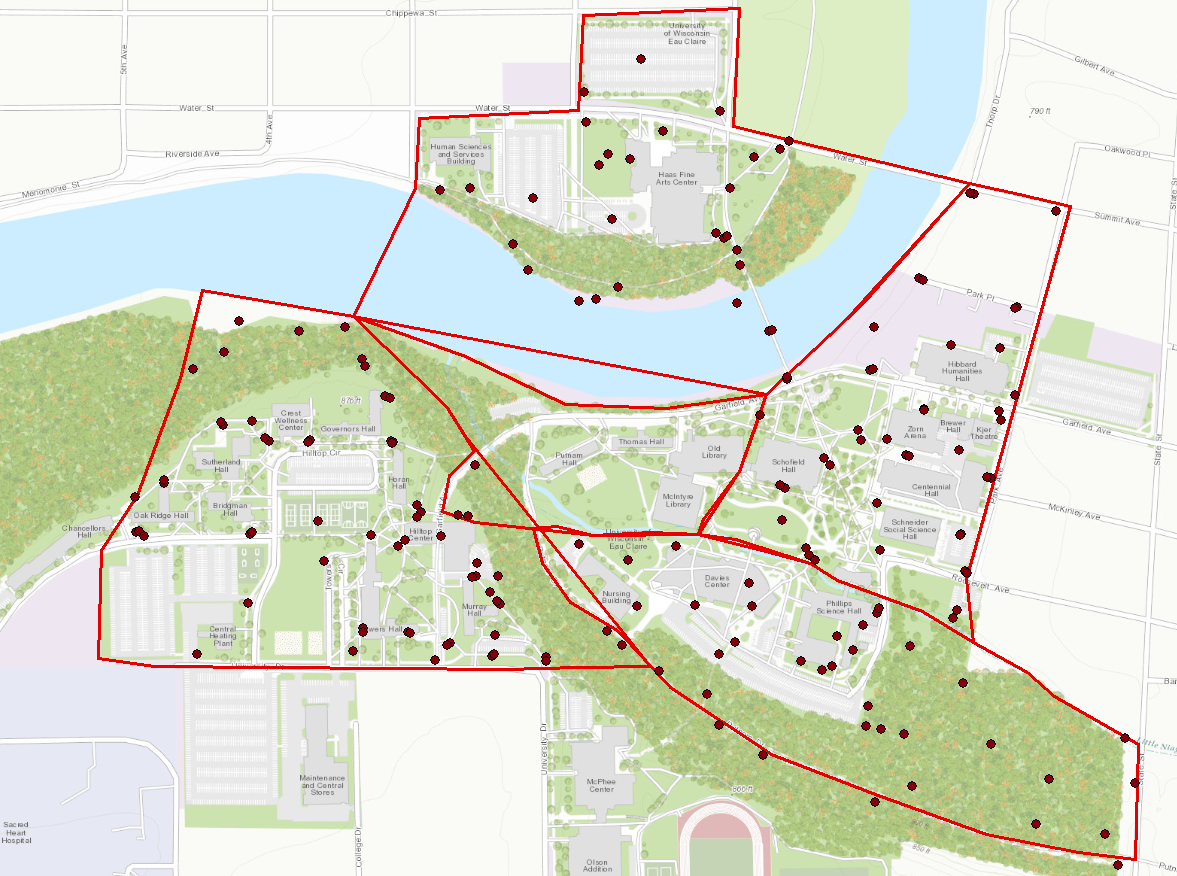
The University of Wisconsin Eau Claire's campus was broken down into 7 different zones. Two pairs of two went to each zone. The zone that we were assigned to was zone 1. Figure 1 below is the map of campus broken up into zones.
 |
| Figure 1: Campus split up into 7 zones |
Zone 1 is the blue highlighted area on the map above. The area also included the walking bridge, Haas academic building, and two large parking lots near the Haas and HSS academic buildings.
Methods:
Before we could gather data points, we needed to download Arc Collector from the app store in order to connect our devices to ArcGIS online. ArcGIS online makes it possible to run the software through devices such as a cell phone, or anything with a high processing system. After we connected to ArcGIS online, we went over the attribute data that was going to be collected in the field. The measurements we were taking at each point were the temperature, wind speed, wind direction, and dew point.
Once we reached zone 1, we decided to take our first point in the middle of the walking bridge on campus. We took out our handy Kestrel thermometer to gather the necessary data. We took the temperature and dew point as well as the wind speed and direction. Figure 2 below is a picture taken while recording the third data point.
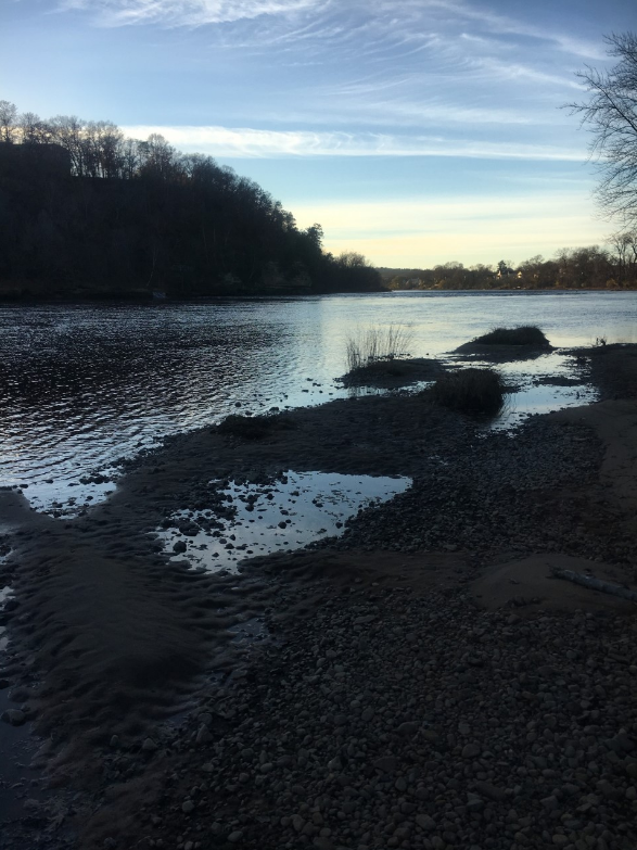 |
| Figure 2: A photo taken at a data point |
 |
| Figure 3: Data points collected by the entire class |
 |
| Figure 4: Attribute table for the classes data |
 |
| Figure 5: A map of temperature across the UWEC campus |
The temperature was gathered in Fahrenheit for this lab, so all map with temperature will be in Fahrenheit. Figure 6 below is a map of the dew point across UWEC.
 |
| Figure 6: A map of dew point across the UWEC campus |
The dew point is a measure of the temperature air has to be to condense and form dew. Figure 7 below is a map of the wind speed on campus.
 |
| Figure 7: A map of wind speed across the UWEC campus |
The wind speed was measured in miles per hour for this lab. Figure 8 below is a map of the wind direction while taking the data points.
 |
| Figure 8: A map of wind direction across the UWEC campus |
The direction the wind was coming from was recorded along with the rest of the attribute data for each data point. I chose to keep the wind speed in the map to show which ways the wind was blowing very strong versus not very strong. I made all of the continuous surface features 15% transparency on each map to give an idea of where each data point is located.
Results:
Each map above is different from each other, yet they have everything in common. The wind speed map is particularly interesting in that the wind speed was highest on the middle of the walking bridge. There is always a lot of wind when walking over the bridge, so the map was not surprising, yet it still interesting. I originally did not have my maps with a 15% transparency, and I am very glad I went back to change that. The transparency of the continuous layer makes it easier to see where the data points were taken. The temperature is nearly even across the map, and that could be because the sun was shining and it was a very nice day out. The one interesting area on the temperature map was an area that is heavily wooded. That area was much colder than the rest of campus most likely due to the fact that the sun was not shining on that area. The dew point was higher in areas of more populated areas such as the Davies parking lot and the back of Davies area. The dew point was much lower in areas where things were more spread out and there were less people. The wind direction was all over the place, so this could be because of human error, or the wind was blowing in many directions while we were gathering data. The possibilities for both options are very likely, so there is no definite answer to why the wind was blowing in so many directions.
Conclusion:
This lab exercise allowed me to gain knowledge about a new way to collectively gather data. Arc Collector had opened many doors of opportunities in the field. Arc Collector was very effective in that the entire class was able to create a set of points with normalized data without any problems. It would be interesting to look at micro-climates across UWEC in more detail and with more fineness. There may have been some patterns in the data that I missed, but for the most part, this lab was definitely a success. Arc Collector did its job of putting together all of the data gathered, and we were able to successfully analyze four different types of micro-climates at UWEC.
No comments:
Post a Comment