Tuesday, November 29, 2016

Arc Collector

Introduction:

This lab is designed to continue developing the skills gained in the last lab with ArcCollector. The use of cellphones is nearly universal, so ESRI decided to cash in on the cellphone fad by making an app that allows for data gathering with the touch of a thumb. In the previous lab, we used a database that was set up prior to use. In this lab, each student created his or her own database with their own question in mind. Since each person has their own database, it is critical the domains are set up correctly. This specific lab is analyzing the temperature at ground level, temperature at 2 ft in the air, type of ground, and whether or not it needs an upgrade from the UWEC grounds-crew. The completion of this lab depends on a successful database set-up, smooth data gathering with the kestrel thermometer, and ArcMap on the desktop computer to create the final product.


Study Area:

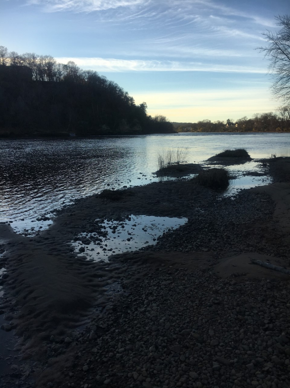
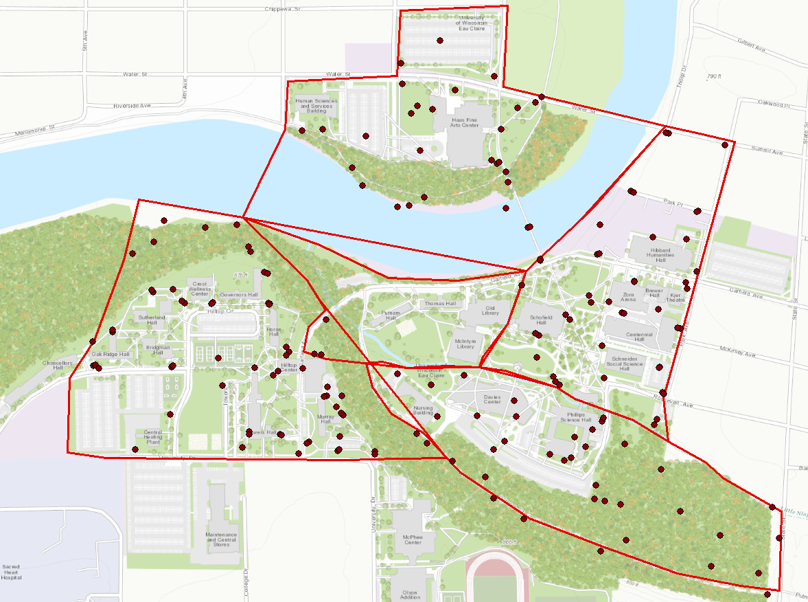
The study area for this lab is nearly the same as it was in the previous lab. The UW-Eau Claire campus on the South side of the Chippewa River is the study area for this lab. Figure 1 below is a map of the area of interest. UWEC's main campus is the study area for this lab. The data was collected on 11/29/16 at around 11AM, so the temperature had not peaked for the day. The high for the day was 46 degrees Fahrenheit.
Figure 1: The study area of this lab is the UWEC campus

Methods:

In order to set up the online database, there were a few requirements for this lab. One was the database required three fields for attributes, one text field for notes, a floating point or integer, and one of the persons choice. The different domains help normalize the data in the field to make data collection enjoyable instead of frustrating. Figure 2 below is the domains used for this lab.
Figure 2: The domain for the database
The domains for this lab are: ground condition, ground cover, notes, temperature at 2 feet above the ground, and the temperature at ground level. The temperature domains required a long integer field type. The notes field is text and the ground condition and cover are both coded values. This means the one of the coded valued must be selected.

Once all of the domains were set in place, a test point was used in the corner to make sure there were no errors in the set up--which there was not, so the data gathering was the next thing to do. 20 data points were gathered around the UWEC campus. Once the data was collected, it was brought into ArcMap to create the continuous model of the temperatures at two different heights.

Results/Discussion:

Figure 3 below is the final map of the temperature in Fahrenheit at ground level. Most of the data points were between 39 and 41 degrees Fahrenheit.
Figure 3: A map of the temperature at ground level

Figure 4 below is the final map of the temperature in Fahrenheit at 2 feet above the ground. Most of the data points were between 37 and 38. This is nearly two degrees less than the ground level temperatures.
Figure 4: A map of the temperature at 2 feet above ground level

The results of this particular lab were slightly different than initially thought. The temperature was overall colder 2 feet in the air whereas the ground level temperatures were all warmer. This could be because the ground is still in the process of freezing for winter, or because the larger the distance away from the ground, the colder the air will be. Unfortunately, the colder temperatures caused for a shortened data gathering time, so only 20 data points were collected in total. Overall, this lab proved to be a tough challenge, yet rewarding at the same time. The link below is a interactive map on ArcCollector with the data points collected. (http://arcg.is/2g4mCMD)


Monday, November 14, 2016

Micro-climates at UWEC

Introduction:

Cell phones often times have a higher computing speed and power than most GPS units, so it is a reliable option to use online data to aid in data collection. Arc collector is an app that allows data collection online from a cell phone or tablet. This opens doors for gathering data in places that was once difficult. As an entire class, we split up with a partner and went to the assigned zone. Once within the zone, you and your partner could start taking GPS points anywhere you wanted. We gathered 175 data points total as a class. As we were gathering data, we could see other groups data points pop up on our own maps. This is the exact reason why Arc Collector is such a useful tool. Many people can access and gather data in real time while being together or many miles apart.


Study Area:

The University of Wisconsin Eau Claire's campus was broken down into 7 different zones. Two pairs of two went to each zone. The zone that we were assigned to was zone 1. Figure 1 below is the map of campus broken up into zones.
Figure 1: Campus split up into 7 zones 

Zone 1 is the blue highlighted area on the map above. The area also included the walking bridge, Haas academic building, and two large parking lots near the Haas and HSS academic buildings.


Methods:

Before we could gather data points, we needed to download Arc Collector from the app store in order to connect our devices to ArcGIS online. ArcGIS online makes it possible to run the software through devices such as a cell phone, or anything with a high processing system. After we connected to ArcGIS online, we went over the attribute data that was going to be collected in the field. The measurements we were taking at each point were the temperature, wind speed, wind direction, and dew point.

Once we reached zone 1, we decided to take our first point in the middle of the walking bridge on campus. We took out our handy Kestrel thermometer to gather the necessary data. We took the temperature and dew point as well as the wind speed and direction. Figure 2 below is a picture taken while recording the third data point.
Figure 2: A photo taken at a data point
We recorded 11 data points in zone 1. After all groups had finished collecting their data, we could all look at our individual maps, but they all had the same exact data. This is a great way to keep data normalized. Figure 3 below is a map of all the data points collected by the class.
Figure 3: Data points collected by the entire class
Figure 4 below is the attribute table for all of the data points located in figure 3 above. The four columns that were of main interest were: TP, DP, WS, and WD.
Figure 4: Attribute table for the classes data
Since all of the data points are together, we could make several maps of the four micro-climates on campus. For all of the following maps, I created a continuous surface feature to show the interpolated average of each of the attributes. I used the inverse distance weighted (IDW) interpolation method on all of the maps. The IDW interpolation method estimates cell values by averaging the values of sample data points in the near area of each processing cell. Figure 5 below is the map created with temperature data.
Figure 5: A map of temperature across the UWEC campus

The temperature was gathered in Fahrenheit for this lab, so all map with temperature will be in Fahrenheit. Figure 6 below is a map of the dew point across UWEC.
Figure 6: A map of dew point across the UWEC campus

The dew point is a measure of the temperature air has to be to condense and form dew. Figure 7 below is a map of the wind speed on campus.
Figure 7: A map of wind speed across the UWEC campus

The wind speed was measured in miles per hour for this lab. Figure 8 below is a map of the wind direction while taking the data points.
Figure 8: A map of wind direction across the UWEC campus

The direction the wind was coming from was recorded along with the rest of the attribute data for each data point. I chose to keep the wind speed in the map to show which ways the wind was blowing very strong versus not very strong. I made all of the continuous surface features 15% transparency on each map to give an idea of where each data point is located.


Results:

Each map above is different from each other, yet they have everything in common. The wind speed map is particularly interesting in that the wind speed was highest on the middle of the walking bridge. There is always a lot of wind when walking over the bridge, so the map was not surprising, yet it still interesting. I originally did not have my maps with a 15% transparency, and I am very glad I went back to change that. The transparency of the continuous layer makes it easier to see where the data points were taken. The temperature is nearly even across the map, and that could be because the sun was shining and it was a very nice day out. The one interesting area on the temperature map was an area that is heavily wooded. That area was much colder than the rest of campus most likely due to the fact that the sun was not shining on that area. The dew point was higher in areas of more populated areas such as the Davies parking lot and the back of Davies area. The dew point was much lower in areas where things were more spread out and there were less people. The wind direction was all over the place, so this could be because of human error, or the wind was blowing in many directions while we were gathering data. The possibilities for both options are very likely, so there is no definite answer to why the wind was blowing in so many directions.

Conclusion:

This lab exercise allowed me to gain knowledge about a new way to collectively gather data. Arc Collector had opened many doors of opportunities in the field. Arc Collector was very effective in that the entire class was able to create a set of points with normalized data without any problems. It would be interesting to look at micro-climates across UWEC in more detail and with more fineness. There may have been some patterns in the data that I missed, but for the most part, this lab was definitely a success. Arc Collector did its job of putting together all of the data gathered, and we were able to successfully analyze four different types of micro-climates at UWEC.


Tuesday, November 8, 2016

Navigating the Priory with a Map and Compass


Introduction: 

The purpose of this lab was to use the maps we created last week in class to navigate the terrain to find points behind the Priory. The Priory is a UW-EC owned building about 5 miles away form campus. I was part of group two with two other people. For this lab, we could only use one persons maps we created last week. For this lab, we ended up using the maps I created as well as a compass to find five points behind the Priory. We brought a GPS along with us to track our path. We were given five points to find in UTM meter form. 

Methods: 

After meeting at the Priory on November 2nd 2016, we had to approximate where the five points we needed to find were on the map. The ticks on the map were in 50 meter increments that helped approximate where the point would be out in the field. Figure 1 below is a picture of the five coordinates we needed to find. 
Figure 1: Five coordinates group 2 needed to find
Once we knew where we were headed, we needed to figure out our pace count for 100 meters. My pace count was 76 paces per 100 feet. The pace count is used when moving towards a distant object when direction is not clear. In this case, we had to walk in the woods and find our points, so using a pace count to track our distances was helpful. We also used a Trimble Juno 3B GPS as seen in figure 2 below to track our path to our points. 
Figure 2: The GPS group 2 used to find the 5 points on the paper
In order to find the coordinates we were looking for, we used the compass to find the angle degree we were going to walk in. We pointed the north arrow of the compass north and lined up the compass in a straightedge to the point. This gave us a working "compass" to the point. We needed to do this from each point to the next. We decided to go to point 1 first, point 5 second, point 4 third, point 2 fourth, and point 2 fifth. In order to use the compass, we had to adjust the reading for each point. Then, we had to hold the compass at chest level to read the direction we had to walk. The person holding the compass stayed in one place and another person counted their paces to a tree in the compasses path and stayed there. We repeated this process over and over again until we found all our points. 

Results:

Group 2 took a rough path to our first point. Figure 3 below is a map of the track the GPS captured. 
Figure 3: A map of the GPS tracked as we were finding the five data points
It took a while to get used to finding the coordinate points. We took a heavily wooded path to the first data point labeled '1' on the map above. We then went to point '5' but we took a walking path to avoid going back into the dense brush. Then we went to point 4 which was close to point 5 and it was relatively easy to find. Then we went to point 3 and finished with point 2. 

Figure 4 below is a map of the GPS path of all of six groups in the class. The pink dots on the map represent all possible coordinate points given to the entire class. It is clear that all of the paths captured by the GPS were not straight lines and it appears that we all ran into some type of problem that took the group off course. Sometimes we were slightly thrown off because a large tree or massive brush pile was in our way. We had to move around nature and figure out how to overcome problems regarding paths.
Figure 4: A map of the GPS tracked paths for all six groups in the class

Conclusion: 

This lab featured using a map with a grid system to find five points in the Priory that were given to us as coordinate points. All we could use was our maps, a GPS for tracking, and a compass. The overall execution of this lab was definitely attainable and really taught me how to reach a destination with coordinates only.  
Using a 50 meter UTM grid was an okay measurement for this lab. The spacing was a little far apart, but it worked out in our favor nonetheless. This lab made it clear that straight lines from one point to another are nearly impossible because of the surrounding landscape. From an aerial view, the Priory does not seem like tough terrain to hike, but elevation changes as well as dense forests caused a bit of a struggle for group 2. 


Tuesday, November 1, 2016

Development of a Field Navigation Map


Introduction:

In order to navigate around the Priory (the study area), we need to know some type of location system, coordinate system, and some type of projection. The issue is that coordinate systems can confuse people depending on what scale they are working with. For example, State Plane and UTM are two popular coordinate systems, yet they are very different. UTM is measured in meters whereas State Plane is measured in decimal degrees. UTM is a popular coordinate system because it is universal and can be used anywhere. A projected coordinate system provides various mechanisms to project maps of the earth's spherical surface onto a two-dimensional Cartesian coordinate plane. A geographic coordinate systems use latitude and longitude. A UTM is more accurate because it is a coordinate system altered to better fit the area of interest. For this lab, we will be creating two maps for navigation around the Priory, one that utilizes the UTM coordinate system and another coordinate system that uses decimal degrees.

 
Methods:

Before we created our maps in ArcGIS, we formatted the paper so the dimensions were 11X17 and the paper was in landscape format. The maps had to include the following: north arrow, a scale bar, what projection it is in, the coordinate system of the map, a labeled grid, data sources, a background, and a watermark.

Results:

In order to create a map that is useful in helping find points via GPS points, a grid drawn across the background image is very important. Figure 1 below is a map of the UWEC Priory. The coordinate system is UTM, so the grid is measured in meters. It is clear that the grid is meters because there are no coordinates, but rather measurements by meters. After placing the grid, I used the contour tool located under raster surface in ArcMap to create 25 and 10 meter contour lines.

Figure 1: A map of the Priory using the UTM coordinate system
 Figure2 below is the same map as above, except is in a geographic coordinate system that uses decimal degrees. This is where the latitude and longitude come into play. They are used instead of measurements around the grid. I used the same contour lines in figure 1 as I did in figure 2.
Figure 2: A map of the Priory using a coordinate system that uses decimal degrees


Conclusion:

The two maps created for this lab required a lot of initial thought process to create a usable map. This was the first time I created a map that I will use in the field. Many people have issues with coordinate systems depending on what scale they are working with, and it can really confuse people. I think that the UTM map will be easier to read, but I will find out on Wednesday. Overall, creating these maps has really clarified the use of coordinate systems versus latitude and longitude for me. I am excited to see how it goes in the field.